Graphic
Design |

The 'final' image can be clicked on for an enlarged version.
October Falls - Version 1 Like 'Starcrest', the original idea is what kind of stuck as the design when it came to 'October Falls'. The idea had to be simple and dark just as the experiences of the characters in the story were. |
|
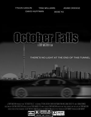
October Falls - Version 2 - FINAL The final and current version of the poster. I decided that a little color wouldn't hurt and when I added the orange logo, I was surprised how much life it added to the poster. I also fixed the abrupt fade of the Toronto Skyline which is where the story takes place. ** the skyline of Toronto was found on the internet on a now non-existent website. |
|
Graphic
Design |
All website
content including, though not limited to, graphics, images, screenplays, poems
and overall web site design are original work by Tony Machin (unless otherwise
specifically noted)
Technical problems,
bad links, misdirected pages or missing file problems should be reported to
admin@tonymachin.com
Copyright ©
2004 Tony
Machin
All Rights Reserved